Evil UX patterns for attention seeking apps.
 David Hernandez
·
18 Feb 2020
David Hernandez
·
18 Feb 2020

David Hernandez
·
18 Feb 2020
David Hernandez
·
18 Feb 2020
You wake up in the morning, probably with the alarm of your phone or maybe your smart watch, and most of the time the first thing you do is disable the “Do Not Disturb Mode”, and BANG! a race starts. All your apps are now in competition for your attention.
If you’re working and you need solid blocks of uninterrupted time (like I do as a developer) then these little attention grabs can be very counterproductive.
Nowadays, your phone is just an extension of your online life; many activities that were considered offline, like watching TV, playing video games, doing some exersice, or even sleeping, now have an online extension; an app, a website, or a service. And they’re all competing to get your attention.
If we don’t count sleep tracking apps, the rest of them have around 16 hours/day of your attention to compete for.
You may have an email notification from work, a Twitter mention, some Slack messages, or an Instagram notification (yeah, that sushi that you ate last night looked good!). But your time is limited and you also want to have offline activities, like spending time with your family or friends, or reading a book.
The time that you spend on these services is a metric that companies want to maximize, from the number of hours that you watch Netflix, to the number of messages sent in Slack. Companies use certain UX patterns to make that happen.
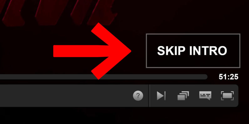
Netflix lets you skip the intro to give you the false sense that you are optimising your time watching TV, but later shows you the preview or even autoplays the next chapter to keep you watching.
It’s well known that an element of surprise generates a shot of serotonine. Instagram combines random surprises with their infinite scroll, the combination of which can keep you scrolling for hours (“I’ll wait for more cool post and then I can close the app”).
This is also one of the reasons why Twitter doesn’t let you order your timeline by time (we probably shouldn’t call it timeline anymore).
By far one of the most annoying UX patterns that these apps use is the color RED.
If you study or read about UI/UX and design (and colour theory), everybody tells you that the color red is very disruptive to humans, to the point that as a guideline it should only be used for errors, or exceptional situations, like a fire alarm or STOP sign.
Or like this panic button at my gym:
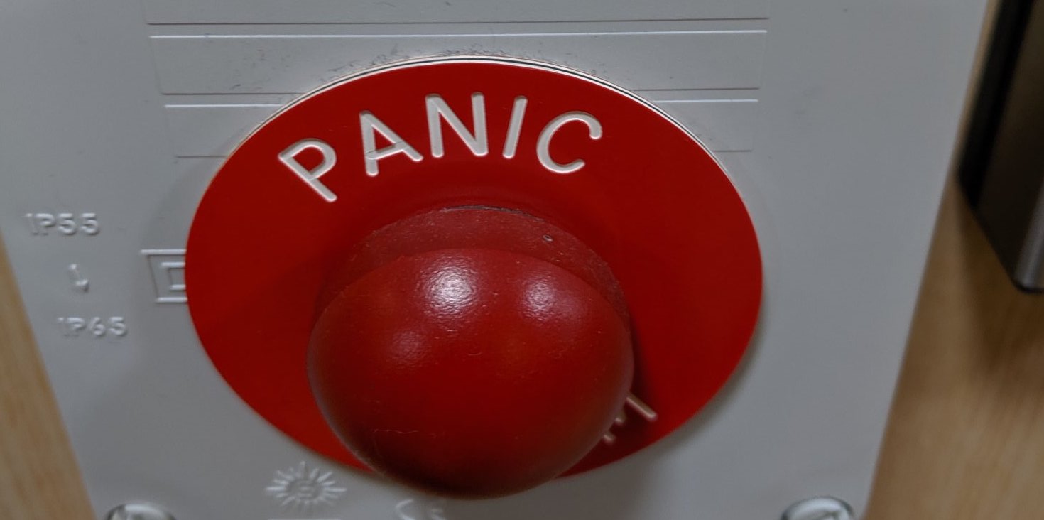
Notice how this red panic circle looks just like the notification counter on some of your favourite apps. This makes sense for a PANIC button, but not when somebody has sent me the GIF of a kitten!
Whenever we see that red circle, we naturally want to get rid of it (or resolve it). In the competition for attention, this is irresistible.
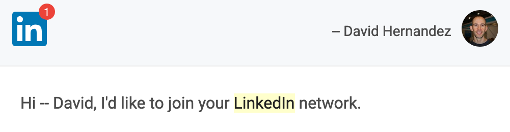
Even when LinkedIn sends you an email, it uses a red dot to bug you into taking action:
It is no coincidence that the icon for the “What’s New” option in Slack is a wrapped gift, so you subconciously link it in your brain with an element of surprise. Combine that with red color, and a counter that the user is urged to set it back to 0, and you have all the elements you need to get the user hooked on this habit.
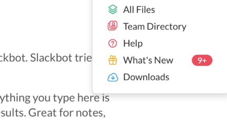
I have clicked many times on this “What’s New” button, and I haven’t found anything useful so far.
Some patterns create a false sense of urgency.
Here, Mat is typing…
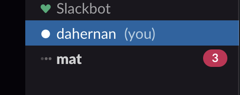
I am driven to reply immediately becuase Mat is typing right now. I have three unread messages (again in red) and if I want the immediate gratification of removing that red blob, all I have to do is click and read it. After I’ve done this a few times, this starts to become a habit.
Because of this, Mat is also now expecting an immediate reply. So the habit is being formed in him as well.
You can always disable notifications, or encourage good practices within your team, or choose not to watch the next episode of the TV show.
You can spend time in the preferences of your services or apps where available to ask them not to bother you so much.
However, breaking habits takes a lot of time and effort and we think it falls to product designers to design tools that help us form good habits and respect people’s time by default.
At Pace we are building tools designed to make you more productive, while properly respecting your time and attention.
Communication will be asynchronous by default so people can focus on their work. There will be no red circles trying to coerce you into clicking them. The time that you spend in the app is not going to be a metric of success for us, we want to try to balance your FOMO (Fear Of Missing Out) with your JOMO (Joy Of Missing Out).
If this resonates with you, please introduce yourself on the pace.dev homepage.
A lot of our blog posts come out of the technical work behind a project we're working on called Pace.
We were frustrated by communication and project management tools that interrupt your flow and overly complicated workflows turn simple tasks, hard. So we decided to build Pace.
Pace is a new minimalist project management tool for tech teams. We promote asynchronous communication by default, while allowing for those times when you really need to chat.
We shift the way work is assigned by allowing only self-assignment, creating a more empowered team and protecting the attention and focus of devs.
We're currently live and would love you to try it and share your opinions on what project management tools should and shouldn't do.
What next? Start your 14 day free trial to see if Pace is right for your team
David Hernandez
or you can share the URL directly:
https://pace.dev/blog/2020/02/18/evil-ux-patterns-for-attention-seeking-apps-by-david-hernandez.htmlThank you, we don't do ads so we rely on you to spread the word.
If you have any questions about our tech stack, working practices, or how project management will work in Pace, tweet us any time. :)
— pace.dev (@pacedotdev) February 25, 2020
Passive user preferences with persisted stores in Svelte #sveltejs #javascript #typescript
How code generation wrote our API and CLI #codegen #api #cli #golang #javascript #typescript
Tiny abstractions with functions in Go #golang #concepts #coding #patterns